How to create a mobile-friendly PDF
Creating mobile-friendly PDFs is now easy and takes a few clicks
Celero data has shown that 40% of visitors view websites from a mobile device, with email campaigns and messaging campaigns leading to even higher percentages.
Up to this point, organizations were forced to a one-PDF-fits-all approach, or they had to invest in mobile responsive designs.
But why not bring the pixel perfect PDF layout to the web automatically?
How does it work?
After adding a mobile friendly-version, anyone coming from a mobile device will get the mobile content vs the original content you've uplaoded.
Visitors coming from Desktop will continue to see the previous version.
You don't need to share a new link - the same link you've already shared will now be even smarter.
Adding a mobile friendly version
Using the same assets from your existing PDF, you can now create a mobile friendly version and upload it to Celero.
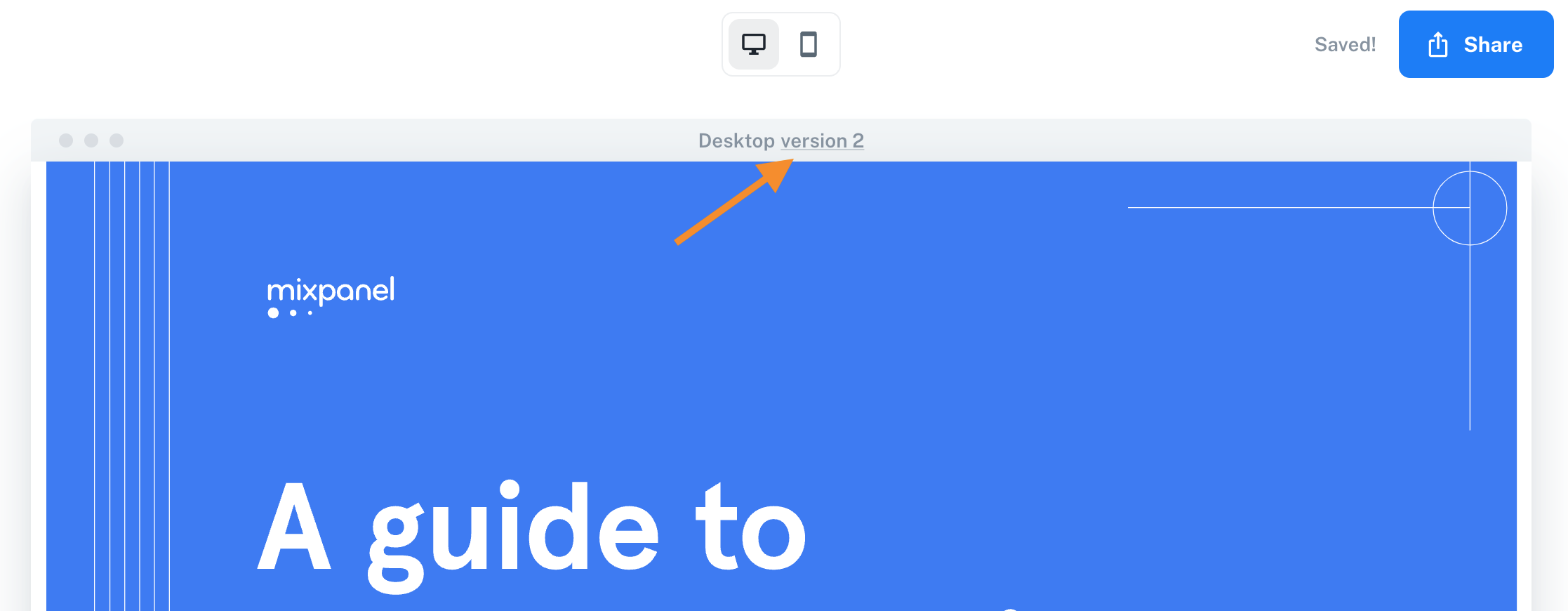
Simply go to your Microsite, and click the "versions" above the preview pane:
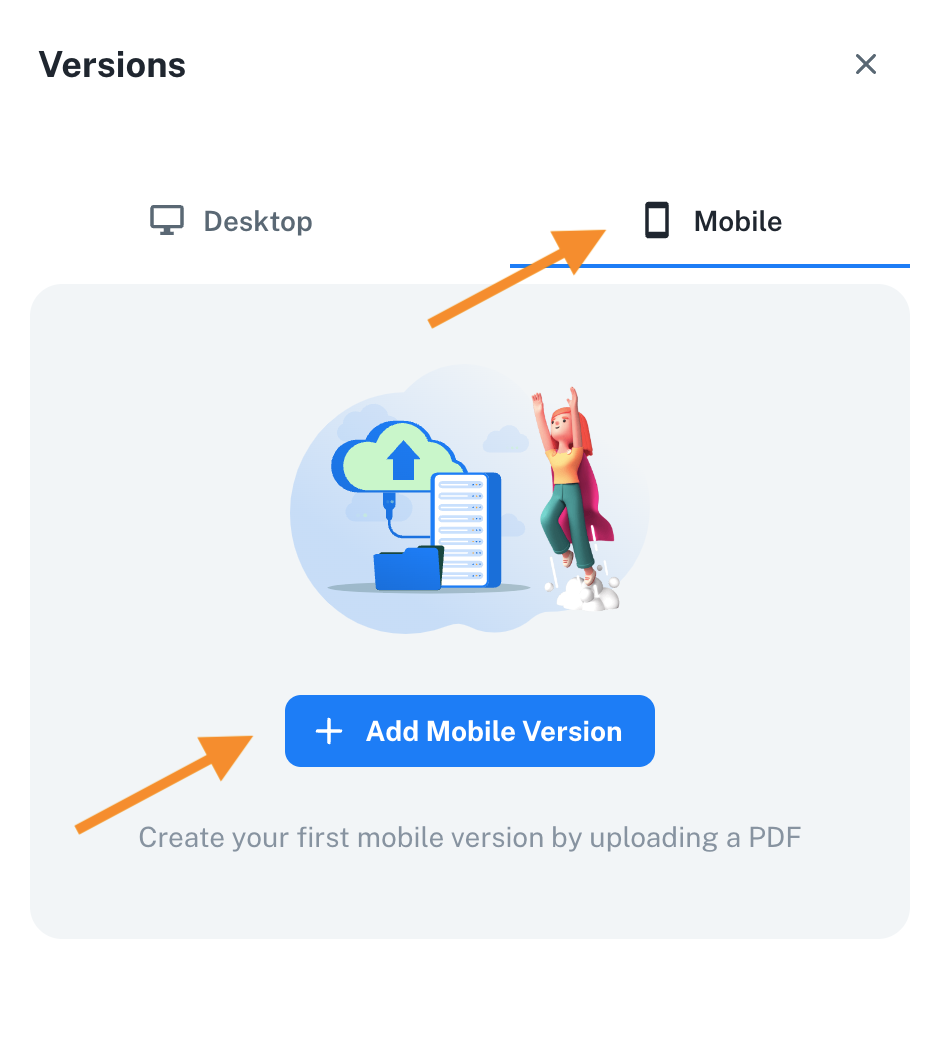
Click on the "Mobile" tab at the top and then click the + sign
Best practices for creating a mobile version
Here are a few common best practices we've collected for creating a mobile-friendly version:
1. Use an iPhone X size base for the pages (1125 x 2436px)
2. Use big fonts, 42pt for the paragraph (text) and titles 54pt or bigger.
3. Leave a 36px margin on the sizes
4. Try to have something visual on the pages, but don't take too much space to minimize scrolling.
5. On specific pages, you can play around with images, icons and different background colors for a more appealing and dynamic look.
We'll be happy to hear your recommendations!